Running modded Cities Skylines 1 on Linux in 2023
11 June 2023
Cities Skylines runs great on Linux PCs, but mods often lack instructions for Linux installs. Here are my notes on how to get a few common mods running.

Mount a single drive from a two-disk Synology SHR RAID 1 group, on Pop!_OS (or another Ubuntu-like OS)
13 April 2023
In which Zarino recovers data from his parents’ dead two-disk DS214se, by mounting one of its drives read-only on his Pop!_OS PC.
Running Transmission and ZeroTier One via Docker on Synology DSM 7
1 April 2023
In which Zarino finally gets round to upgrading the operating system on his Synology NAS, and, as a result, has to work out how to install the Docker versions of two of the pieces of software he runs on it.
Learning design: resources for non-designers
21 October 2022
Every now and then, a developer, product manager, or marketing person will ask me how they can “learn design”. And I’ll have no idea where to start. Well, this post is (finally!) my attempt to answer the question.
Notes from the Far East: Part 3
30 October 2021
A short diversion into my ethical qualms with cruise holidays, before returning to the final leg of my 2019 trip around the South China Sea, featuring Da Nang and Ho Chi Minh City in Vietnam, and Singapore.

Census day
21 March 2021
A census has been taken in the UK for over 200 years. But this is the first time it has included questions on gender and sexuality. I take a moment to reflect on how this makes me feel.
Notes from the Far East: Part 2
26 September 2020
Photos and memories from the middle section of my 2019 trip around the South China Sea on the Quantum of the Seas, covering Fukuoka in Japan, Taipei in Taiwan, and Hong Kong.

Notes from the Far East: Part 1
29 August 2020
Photos and memories from the first leg of my 2019 trip around the South China Sea, starting with three days in Beijing.

Self-hosting Google fonts
1 June 2020
Creating and self hosting your own WOFF and WOFF2 fonts isn’t hard. Here’s how to do it.
Controlling the fan curve of an AMD GPU on Pop!_OS (or other Ubuntu-like operating systems)
23 April 2020
The open-source amdgpu driver doesn’t come with any visual controls over fan speeds and overclocking. But with a little bit of Linux know-how, you can create your own system service to monitor and adjust fan speeds to your liking.
Setting up a Raspberry Pi from a Mac
22 June 2019
Quick notes on installing Raspbian and SSHing in over wifi on the first boot.
Compiling and using the uDMX command line utility, on a modern Mac
21 June 2019
uDMX USB-to-DMX controllers are a cheap, open source way to control DMX devices from your computer. But documentation on getting them running is poor. Here’s how to get a typical uDMX interface running on a modern Mac.
Uninstalling a Mac kernel extension
31 May 2019
Notes from a late night dive into the world of renegade Mac kernel extensions, and how to get rid of them when they prevent your Mac from booting.
Starting or stopping Synology packages from the command line, or automatically on boot and shutdown
20 February 2019
Sometimes a package will stubbornly refuse to start when your Snology NAS boots up. Or sometimes you just want to run a custom script on a schedule without delving into cron. Here’s how.
Thirty
19 December 2018
Some thoughts on what’s important in life, as I turn 30. Featuring Earth, the universe and everything; an over-stuffed schedule; and the hamster ball of safety.

Debugging crappy internet connections from the command line
24 October 2018
As part of recent broadband provider switch, I had to quickly become a bit more literate about testing network connections. Here’s what I found out.
Altering the “Added” date for video files in Synology Video Station
3 January 2018
By default, Video Station sorts your library in “Recently added” order. But this order can get messed up when you migrate disks or re-index your library. Here’s how you can fix it with a little bit of SQL.
Queer podcasts you should already be listening to
12 September 2017
I’ve been riveted by these three podcasts recently, and if you give them a try, I’m pretty sure you will be too – whether you identify as LGBT or not.

A weekend in Liverpool: Things to see and do
23 June 2017
You’re visiting Liverpool for a few days, and you want to make the most of your spare time. Well here are 10 suggestions of things to see and do, and 10 places to eat and drink, from someone who lives here.

Human Rights: The thin end of the wedge
7 June 2017
In the wake of a series of terrorist attacks, Prime Ministerial candidate Theresa May said some pretty extraordinary things about British Human Rights legislation. I want to take a moment to discuss them.

Setting up a Django project on Dreamhost shared hosting
26 December 2016
Fancy running Python-based frameworks like Django on your Dreamhost shared hosting? The Dreamhost docs are pretty out of date, but I’ve got you sorted.
10 second Git tip: Rebase since master
26 October 2016
6 months and 25 days is a long time to wait for another Git tip, but this one’s worth it, especially if you frequently need to tidy up feature branches before merging back into master.
10 second Git tip: What’s changed since master?
1 April 2016
I switch between a number of git projects all the time, and frequently need to remind myself what work I’ve already completed in my branch. This quick command helps me out every time!
Twenty-four switches
23 January 2016
24 switches in a Brighton meeting room. 8 yellow stickers. A smattering of lights. What are your secrets? What cosmic meaning do you hide?

Computing GCSE is 40 years too late
3 January 2016
Zarino starts 2016 with an uneasy monologue about the intersection of technology, business, and politics in the modern day, and how poorly equipped the average person is to deal with them.
A non-Apple mouse that doesn’t completely suck
24 December 2015
In which Zarino discusses finding a comfortable 3rd-party mouse, and how to make the Logitech MX Master feel natural on your Mac.
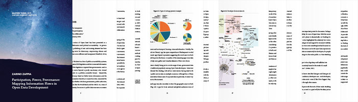
An open data Masters thesis
8 October 2015
Just over four years ago, I’d frantically finished the most involved piece of writing in my life: my Masters thesis about Open Data. Today I take a look back at how Open Data has panned out over the intervening four years.
Accessing a Jekyll site over your local wifi network
16 September 2015
We all know you can access a Jekyll site running locally at a address like http://localhost:4000 – but what about testing it from other devices on the network, like phones, tablets, and virtual machines?
ImageMagick and FFmpeg: manipulate images and videos like a ninja
28 August 2015
A collection of really useful command line snippets for manipulating and converting images and videos in a flash.
Zoetropes and the phi phenomenon
7 August 2015
In which Zarino compares the transit of the moon, stop-motion zoetropes, and the music video to the Correspondents’ Fear and Delight.
Know your arts: Nouveau, Deco, Moderne
17 July 2015
Vintage is in. Impress your friends and up your cocktail party chatter, by learning the difference between the three early 19th-century design styles: Art Nouveau, Art Deco, and Moderne.

Sass: One Year On
1 June 2015
Zarino debunks some myths about CSS pre-processors, and explains why he started using Sass at mySociety
Micropache: Cut the crap out of getting Apache running on your Mac
11 May 2015
Upgraded to a new version of Mac OS X but can’t face the nightmare of getting your Apache-PHP-MySQL stack working? Try Micropache, my one-line Apache server.
My £80 DIY IKEA standing desk
7 April 2015
It’s an object of fascination, jocularity, even lust and admiration. Here’s a quick run-down of how to make your own standing desk, like mine, from about £80 of IKEA parts.
The hacker ethos starts at home
25 February 2015
A response to a recent blog post by Liverpool internet-of-things guru Adrian McEwan, about the importance of the hacker mindset, and how we can get it into the business world.
Is Diskmaker X taking forever to create your bootable OS X drive?
15 February 2015
How to create an OS X installer using Diskmaker X, and what to do when it gives you a cryptic error: “command not found.”
My One-Third Rule for buying books online
5 January 2015
In which Zarino ponders Amazon’s dominance of the bookselling industry, and the warm fuzzy feeling he gets from sitting in a bookshop on a rainy day.

A Synology-flavoured rsync backup script
21 December 2014
A good starting point if you routinely copy files from your Synology DiskStation NAS onto an external USB drive, or a remote server.
Restoring your custom software after a Synology DSM update
20 December 2014
Updated your Synology NAS, and suddenly things are broken when you SSH in. Try this quick trick for setting things straight again.
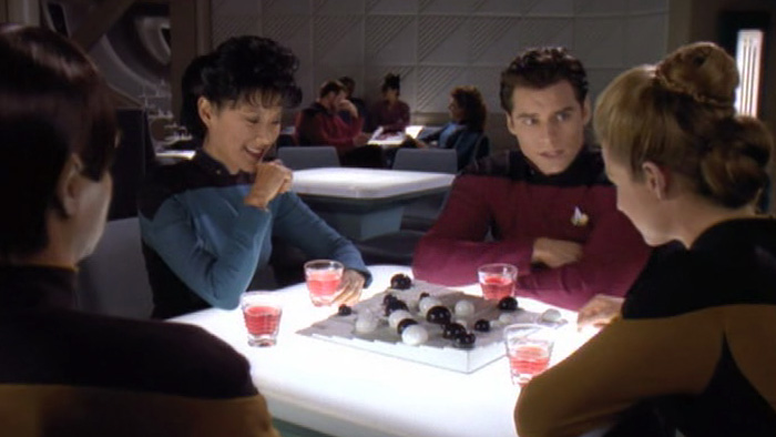
Looking behind the curtain
7 December 2014
In which Zarino confesses justifies a six month Star Trek addiction by pointing out a single episode that helped him be a better designer.
Stop wasting time with Git branch upstreams
3 December 2014
A three-character fix for the infuriating “no tracking information” Git error. Plus some bonus aliases to turn you into a Git ninja.
Music to program to
14 October 2014
Sometimes the right music can help you get twice as much work done. This week, Zarino introduces you to some of his favourite albums to program to.

A moment of silence for the iPod
24 September 2014
A personal eulogy for Apple’s breakthrough device, which passed away quietly, in its sleep, on 9th September 2014.
Putting Awesome into words
2 September 2014
Every month, I get together with ten strangers, and give £50 to Awesome projects all over Liverpool. Find out why…

Attention, toilet door is not locked!
18 August 2014
Every few weeks, work sees me travelling down to London to meet clients. This week my cosy schedule was turned upside-down, and I discovered the weird world of Virgin Pendolino toilets.
A storefront in every pocket
3 August 2014
Amazon released a new phone last week: the Amazon Fire Phone. Will it be the user experience that revolutionises everyday shopping for us all?
How do you make people watch your airplane safety routine?
26 July 2014
Virgin Atlantic takes us on a 5-minute tour of British movie history, from Spaghetti Westerns to The Avengers, Bond to A Space Odyssey.
What the “universal typeface” says about us (hint: not much)
18 July 2014
While attempting to market the “individuality” of its customers, BIC, the yellow ballpoint maker, accidentally shows us how the whole of a Universal Typeface can actually be a lot less than its parts.

Using Spotlight (or mdfind) from the terminal
9 July 2014
A quick demo of how I use Spotlight on Mac OSX to search for words and phrases faster, and more easily, than Grep.
Find out which process is using a port on a Mac
1 July 2014
Tired of getting an “Address already in use” error when you start Jekyll on your Mac? Use this handy command to track down the cause, and get your server back up and running.
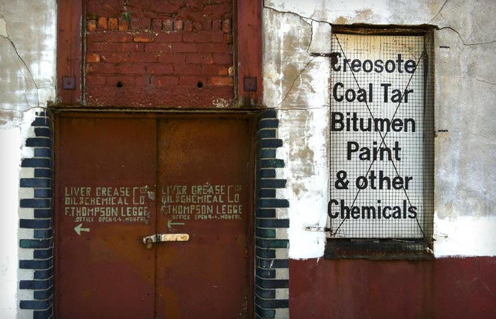
The Liver Grease, Oil & Chemical Co. Ltd.
26 June 2014
A tour of the typography in Liverpool’s Baltic Triangle, starting with the bizarre and exquisite Liver Grease, Oil & Chemical Co. Ltd.
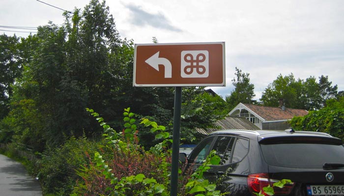
Susan Kare and the ⌘ symbol
19 June 2014
The history of the ⌘ symbol, plus other awesome anecdotes from early Apple designer, Susan Kare.
Sinking underground with Merseyrail
16 June 2014
In which Zarino bemoans Merseyrail’s disappointing lack of visual design acumen, and argues it’s actually indicative of a deeper mindset of complacency.
What’s in a checkbox? (revisited)
12 June 2014
In a follow-up to my debut blog post about opt-in and opt-out decisions, a Sky News producer sues John Lewis for sending him emails after he accidentally left a checkbox ticked at checkout.
Deploying web projects with Git
10 June 2014
How to set up Git and Sass on a typical low-cost web server (in this case Dreamhost) so you can just push your work remotely and have it automatically deployed and running in seconds.
Wrapping your head round the Monty Hall problem
8 June 2014
In which Zarino finally understands the famous probability puzzle, and explains his method for working it out.

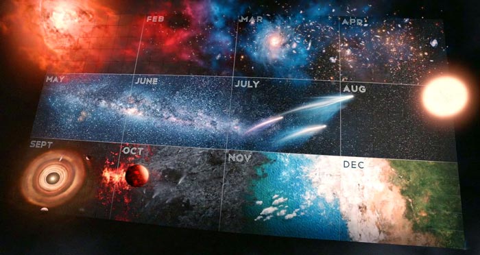
Cosmos: A live commentary
5 May 2014
A minute-by-minute account of the opening episode of Neil deGrasse Tyson’s relaunch of the classic American scientific documentary series. Because, why not?
Are you listening comfortably?
21 April 2014
In which Zarino searches for a comfortable set of headphones for his new remote-working job, and discovers the holy grail in an unexpected place… the Gaming aisle.

Write to an HFS+ (Mac formatted) USB drive from a Synology NAS
18 April 2014
If you use a Mac with your Synology NAS, this trick will save you hours of painful Finder-based copying and restoring. Find out how to write to a Mac-formatted drive directly from your NAS.
Investing in RSS
13 March 2014
In which Zarino reflects on the importance of RSS, exactly a year after Google Reader’s demise. And explains why he happily pays £2 a month for a replacement service.
Distinguishing beauty from utility
26 February 2014
It’s fun to imagine a new user interface that makes car controls simple and delightful. But this month’s rash of style-over-substance YouTube videos isn’t helping.
Breaking news: NHS care.data scheme delayed until “autumn”
19 February 2014
Care.data: Have you opted out yet?
17 February 2014
Organ donation may still be opt-in, but elsewhere in the NHS, people with far too much power and not enough common sense are pushing the button on an opt-out nightmare innocuously called “care.data”.
Could Microsoft lead the re-decentralisation revolution?
7 February 2014
In which Zarino voyages to an alternate reality where Microsoft’s new CEO, Satya Nadella, steers the company to become the new giant of Open Source software and Internet-of-Things hackery.
Teaching everyone to hack
6 February 2014
Teaching kids to program isn’t about the act of actually putting variable to screen – it’s about the mindset that programming introduces. A mindset that British kids simply shouldn’t have to live without.

Synology DS214se: Going under the hood
24 January 2014
A step-by-step guide to setting up SSH access to your Synology NAS, and installing 3rd-party programs.
Time Machine and the Synology DS214se NAS
22 January 2014
Not many Synology owners realise their NAS is a few steps away from becoming the perfect wireless Mac backup system.
Getting started with a Synology DS214se NAS
17 January 2014
An introduction to Synology’s network-attached drives, and how to set yours up with the minimum fuss.
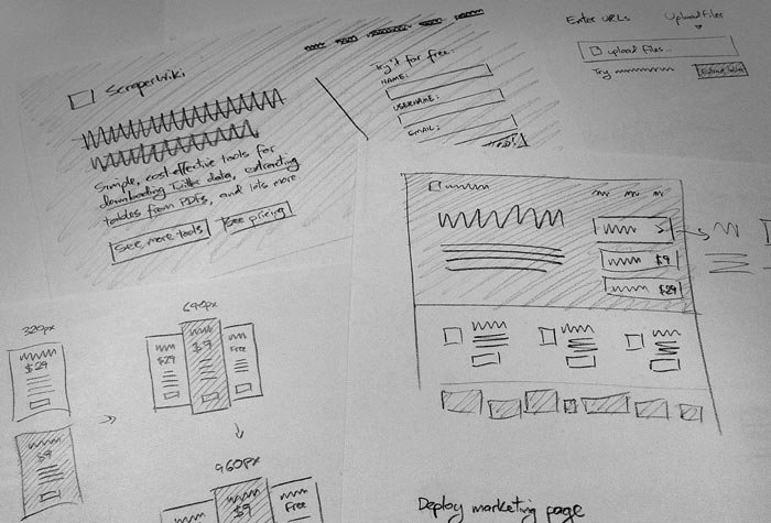
Why I wireframe in pencil
14 January 2014
I’m a designer. I think in pictures. And unlike a growing contingent of designers these days who protest they can’t draw, I sketch everything before I even touch a computer. Find out why…
New Year’s Resolution
2 January 2014
A New Year’s resolution we should all observe: what’s your computer backup solution, and if your main machine died tomorrow, how long would it take you to get up and running again?
Getting to the bottom of Bitcoin
30 December 2013
A realistic survey of the potential of Bitcoin, from the peak of the Winter 2013 hype cycle.
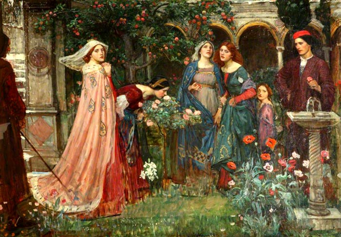
The unfortunate exclusivity of art
21 December 2013
In which Zarino discusses his love-hate relationship with hidden meanings in art, and deconstructs two of his favourite paintings.
What’s in a checkbox?
18 December 2013
A single email newsletter checkbox spurs me into asking: At what point do I, as a designer, have sufficient data to make a decision on the user’s behalf?