Distinguishing beauty from utility
So, a few days ago, this video did the rounds. It depicts “a new car UI” which replaces the typical buttons, knobs, and dials with one big multi-touch screen. It’s an iPad on your dashboard.
Videos like this are fun to make. And we’ve certainly all been inside cars with those ridiculous, obtuse user interfaces: all knobs, buttons, and 90s touch screens. Half-compromises between what a five-years-ago technician could puke up and what the marketing department needed for their shiny cinema ads.
So it’s fun to imagine a new user interface that makes environmental control in your car simple and delightful. And it’s good to know that designers like Matthaeus are thinking about it, because God knows the car manufacturers aren’t.
This video, however, doesn’t help.
Let’s look carefully at what we’ve got. A (probably flat) multi-touch display, which can be used to show maps and driving directions. Tap it with five fingers at once, and you drop out into some sort of home screen, with eight barely-legible icons in circles, arranged in two rows. Above them are the numbers 2, 3, 4, and 5.
Pause the video there. If this were your mate’s car, and you’d just got into it for the first time, would you know how to switch from the USB player to the Radio?
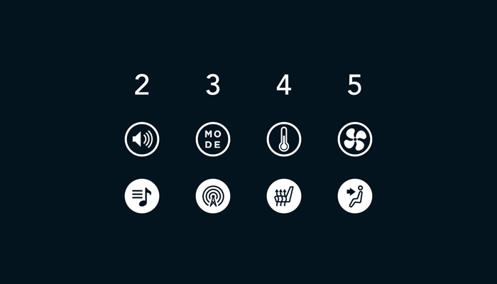
Maybe if you didn’t know, you might guess. It might take me a little while, but I’d eventually guess that “MODE” means “audio source”, and I’d tap the “MODE” button with one finger.
Nothing would happen. Maybe I didn’t press hard enough. I’d probably press again.
When nothing happened again, I’d get confused. Maybe I’m missing a clue somewhere? I want number 3. “MODE”. How do I activate it? This is a touch screen. Surely I just touch the thing I want?
I’ve seen simpler puzzle interfaces in Myst. It’s only when you realise you’re not looking at the user interface itself, but its instruction manual, and that “2 3 4 5” actually means “2 3 4 5 fingers” that you realise what’s going on. This is as un-natural as a mouse on a table controlling a cursor on a screen. At least the mouse has thirty years of inertia in its favour.1 Remind me again why this whole charade is easier to use than a row of discrete buttons?
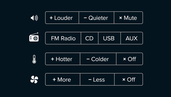
Back to the video: You press a number of fingers up against the screen, and a blue circle surrounds them. A line is drawn from the centre of the circle to the left edge of the screen, and a tiny number is placed at its furthest end. The number is replicated in large type, in the top left of the screen.
As you move you fingers up or down, the circle and line follow, increasing or decreasing the number on the screen – and, one assumes, the thing you’re controlling, be it temperature, volume or, bizarrely, audio source.
If your fingers are close together when you place them on the screen, you get one type of control. If they are spread apart, you get another. (It turns out these are what the second row of icons on the homescreen was trying—and failing—to communicate.)
“All in all, this interface gives you easy control over 8 different settings. And it does that without you having to take your eyes off the road because you’re being distracted trying to hit that one small button on the screen.” — Metthaeus Krenn
So, it’s clear Matthaeus’ goal here is to build an interface that’s simple to use without looking away from the road ahead. We might like or dislike the way he does it, the colour of his circles or the typeface he uses, but if we’re going to judge the design, this is the one thing we can criticise.
And this is where the design fails.
Does this interface reduce the need to take your eyes off the road? Possibly. Given enough time, you’d probably learn the system, and you’d probably find yourself reaching down to a screen with a four-finger claw, rubbing it repeatedly upwards to make the car hotter.
I’m no luddite. I can imagine people would get used to that. Given time and ubiquity, the very concept of “temperature” could become associated with four fingers close together. It would be crazy to think of it in any other way. This is a fantasy interface, so let’s indulge in fantasy: maybe it could happen.
But what have we lost?
Muscle memory. Knobs and buttons are tactile and mode-less. Turning a volume knob always does the same thing, however you turn it, or whatever you’d done immediately previously. The knob is also always in the same place on your dashboard. You quickly develop muscle memory with interfaces like this: you remember the feel of changing the volume, the mechanical actions of finding and turning the knob, without having to think about it. A screen, however, is slippy. How far do you have to swipe to activate the MP3 player? Was that with three or four fingers? Together or apart? Do you have to exit the maps app first? If the answer’s not clear, and you have to look at the screen to find out, the interface has failed.
Hints. Technologies have functions, or affordances, and interfaces usually try to make these clear. The label “Volume” next to a knob immediately clarifies its purpose. In his new car UI, Matthaeus purposefully strips away affordance markers. There are no hints. And as we saw above, “2 3 4 5” doesn’t cut it. How does your gran know what to do when she gets into your new car for the first time? If you tell her, will she remember for next time? Can you instruct her without looking away from the road, because if you can’t, the interface has failed.
Non-visual feedback. Most knobs and buttons I’ve used in a car give audible or tactile feedback when they are used. A volume knob clicks in steady increments as you turn it. A mode dial clicks into place for each discrete setting, so you know you’ve hit each one. Buttons click and depress. Matthaeus’ slidey pictures-behind-glass interface, however, is purely visual. You either blindly hope your fingers are having the desired effect, or you take your eyes off the road to look. And once you’ve done that, the interface has failed.
What would really revolutionise the car UI?
Despite these issues, Matthaeus’ concept video is probably an improvement over the current status quo. (Frankly, it’s hard to be worse.) But let’s look at the bigger picture. Interfaces exist in a context. And that context—cars in the 21st Century—is on the verge of massive change. What really revolutionary changes are on the horizon, and how could the ideal user interface respond?
Driverless cars. I am almost certain that, within my lifetime, I will ride in a car driven by a computer. It simply makes sense. And once that happens, the entire interior environment of our cars will change. Do we need a steering column and a dash? Do we even need two rows of seats? How about a central surface-like table, with four seats around the edge? Or a wrap-around minority-report-like screen that overlays augmented reality annotations on the things you pass in town, and plays TV for the kids in the back? We need to stop thinking about how we can just bolt traditional input devices2 onto our dashboards, and instead think about what’ll happen when we don’t have a dashboard any more.
Voice control. Different, but not mutually exclusive, is the growing trend in voice-controlled interfaces. If we had a human sitting in our car, and we wanted them to raise the temperature, we’d just talk to them, like we did to elevator assistants in the 1920s. We wouldn’t stroke them with two, three or four fingers. We’d just talk. Arguably speech interfaces are just as poorly discoverable as multi-touch ones. But the limit is on the receiver’s intelligence. Maybe it’s just because I watched Her last week, but I’m convinced that recent advances in linguistic parsing like Siri and Watson will bring us computers that literally understand what we’re saying, providing us with a zero-hassle control interface. No secret commands, no looking away from the road, and no undocumented claw gestures. Just natural speech.

Enough about cars; what’s the real issue?
“Have nothing in your house [edit: or car?] that you do not either know to be useful or believe to be beautiful” — William Morris
The modern media ecosystem makes us—and I include myself here—particularly quick to praise something pretty and shiny as awesome, without really thinking about how it helps its users, or whether it actually achieves the goals it set out to. We’ve become lazy. Good design is something you can tweet or upvote.
And Matthaeus’ concept video is beautiful. But it’s been sold as something very different: an interface that solves a problem; an interface that’s useful.
Usefulness (indeed, good design in general) is hard to assess when you’re about to click “retweet”. But as designers, we have a duty to be critical. If we become an echo chamber for the superficially-beautiful-but-ultimately-useless, people will get the wrong idea about what it means to be a designer, and what good design itself is, and that would be A Very Bad Thing™ for us all.
-
I once spent the spare afternoons during my MSc volunteering at the local Age UK branch, giving computing tutorials to over-60s. A few of them were particularly perplexed by the mouse, and it was only then that I realised this input device, which I picked up at about 5 years old, is completely bonkers. Your hand moves on one plane, the cursor another. There are two buttons, which do completely different things, but there’s no indication which does which. And then you run out of desk. It was a sobering experience, and one I highly recommend to any other young designers out there. ↩
-
I can’t believe I’m calling an iPad a “traditional input device.” That’s progress, chaps. ↩