The Liver Grease, Oil & Chemical Co. Ltd.
These days, I work in Liverpool’s Baltic Triangle – a ¼km² patch of what used to be “the city’s workshop”, that is now gentrifying into a hub for the city’s creative industries.
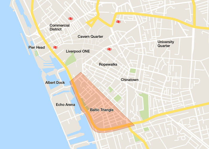
It’s bounded to the south and the west by Parliament Street and the Dock Road1, Liverpool’s main arteries for traffic to/from the south. To the north, there’s Liverpool ONE, the city’s central shopping district, and to the east, there’s a bizarre estate of bungalows and, beyond that, Liverpool’s Chinatown and the Ropewalks.
The map makes it look big, but as anybody who’s visited Liverpool will know, the city centre’s tiny. You can walk from the top of Pier Head to the bottom edge of the Baltic Triangle in 25 minutes.
And once you get there, you’d notice the Baltic has this feeling of accidentality about it. Like somebody just happens to have dropped warehouses full of bearded hipsters and skateboarders in amongst the machinery, car-washes, and crumbling brickwork of an out-of-town warehouse district.
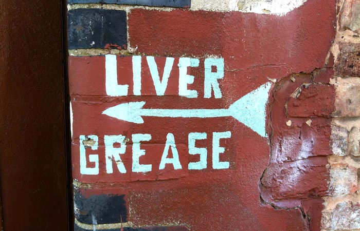
Bits of it are so new you can still smell the paint and plywood. But bits are staunchly, unapologetically, old. None moreso than the Liver Grease Oil & Chemical Company, on the corner of Norfolk Street and St. James Street.
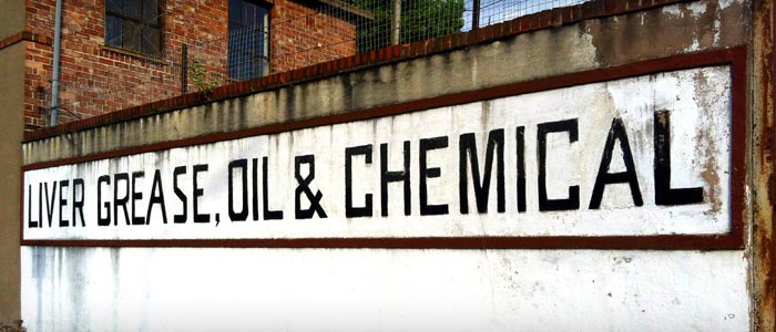
I walk past this place at least three or four times a week. The building itself is nothing to look at; a hodge-podge of rough brickwork and concrete-grey pebbledash. But the hand-painted signs on its walls are a marvel.
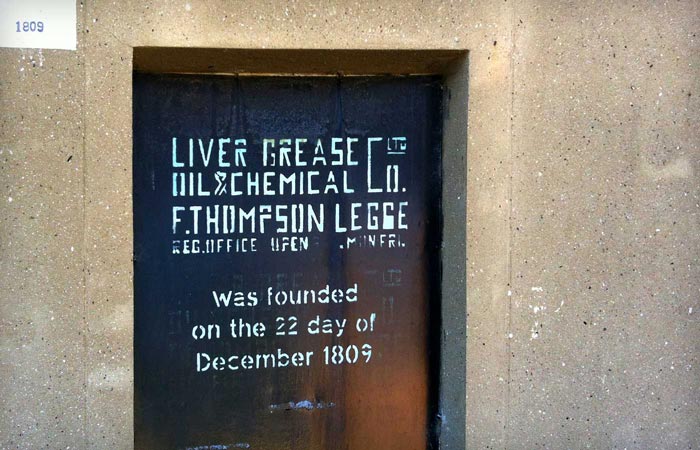
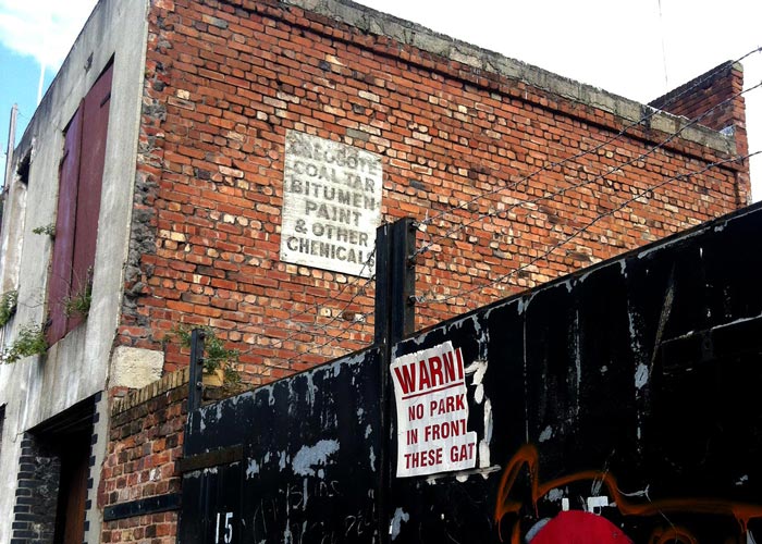
Every possible space on the frontage is taken up with signs. At first it’s hard to date them. But the one nestled into a boarded-up window, below, gives a clue.
The company, it turns out, was established in 1809, under the name “P. Houlgrove & Co. – Turpentine Distillers”. In 1900, it moved to the current site, and the year after, it merged with “Messrs. Liver Grease, Oil & Chemical Company”, from which it takes its current name. But the signs look too modern (and in too good condition) to be from when the company initially moved in.
The Baltic quarter, like the rest of Liverpool city centre, was badly damaged by aerial bombardment during World War II. Maybe the signs came after that?
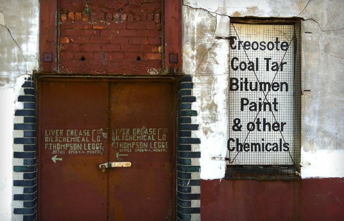
Not likely. “F. Thompson Legge”, mentioned on the sign above, was a relatively recent addition to the Liver Grease family. A long established cement manufacturer based on Duke Street, in the Ropewalks, “Messrs. F. Thompson Legge & Co.” were bought out by Liver Grease some time after the war. I can’t tell when, but I’ve found advertising for Legge’s Iron Cement from 1960, still clearly listing the Duke St headquarters, so at least some of the signs must have been painted after that.
The company’s website tells us that the premises also suffered a spate of vandalism and arsonry in 1969, so maybe what we’re actually looking at is a mixture of pre 1960s hand-lettering, and then early 1970s stencils.2
Either way, the stuff’s gorgeous – in this weird, sort-of, awkward looking geometric way. Just look at the detail in the double height “Co. Ltd” ligature, the custom-drawn futurist ampersand, and the spot where a broken stencil meant the bottom half of the second “G” in “LEGGE” got filled in.

And as if there aren’t enough signs on the building, they figured they’d paint a few arrows on the brickwork, just to be safe. The same square R’s and S’s, although this time without a stencil…
And hey, why not, another sign on the side of the building…
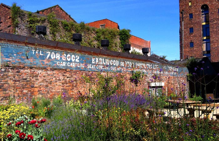
Looking around, on the other side of the road, there are actually a few other really nice bits of painted type. The first overlooks the 54 St James Street garden with a much more professional—friendly, even—slab serif than Liver Grease. Look at that gorgeous cobalt blue background against the brickwork. “Earlwood Motor Products”, it turns out, was the trading name of the building’s current occupiers, “Birch Motors”, between 1976 and 1987. They’ve even still got the same phone number!
And a few steps further down Norfolk Street, there’s a sign for some “Metal Mechants”, although I’m not sure who or what the business was, and whether they’re still there. Google Streetview shows the doorway covered by a second, sliding metal door, which has since been removed, perhaps suggesting the building was renovated since the Googlecar last came by. The paintwork on the shutter also looks pretty new.

And by way of comparison, here’s the modern equivalent to all this corporate signage – this time done in vinyl on glass, in the windows of Apposing, a software development shop barely 100m up the road on Jamaica Street:

The vinyl signs are lovely, and Apposing’s are bang on trend. But I can’t help feeling we’ve lost something from when signwriters used to delicately kern and hand-paint your company’s name, like a great slimy tattoo, onto the side of your building.
I wonder what the far future inhabitants of the Baltic Triangle will make of our hipster fonts and diagonal lines, and our fascination with bird icons. That’s if our signage even lasts that long.
But I tell you what’ll still be there, come rain or shine. The Liver Grease, Oil & Chemical Company, Ltd.
-
This strip of tarmac is probably the most confusingly named road in Liverpool. Ask where you are, and locals will say you’re on the Dock Road. But that’s not its name. (Put “Dock Road, Liverpool” into your satnav and you’ll end up somewhere out of town, towards the airport, in sketchy Garston.) Others, like myself, know the whole thing as “the Strand”, but in reality, the Strand only covers part of the length (from St Nicholas church to Albert Dock) and only in that direction. The other side is called “Goree”. Confusingly, the next section after that, working our way southward, is called “Strand Street”, and after that, “Wapping”. Some might try and call the whole thing the “A5036”, but even that is problematic, since the A5036 is comprised of two separate sections divided by a 2½km gap, and only one of the halves actually travels along the city centre waterfront. ↩
-
And possibly later additions too – there’s clear evidence of over-painting in the window sign, with a repetition of the top logotype being replaced softer, rounder, more modern stenciling for the founding date. ↩